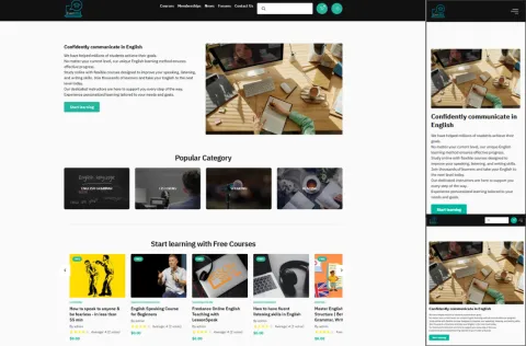
EverLMS is designed with a fully responsive layout, ensuring that your platform looks and functions flawlessly on any device—whether it's a desktop, laptop, tablet, or smartphone. The interface automatically adjusts to different screen sizes and orientations, so learners can access content comfortably no matter where they are or what device they use.
From browsing courses to watching videos, taking quizzes, or submitting assignments, every interaction is optimized for mobile and touch-based experiences. Menus, buttons, and content blocks scale and reposition intelligently to maintain readability and usability without requiring zooming or manual adjustments.
For administrators and instructors, the responsive design ensures that content management, reporting, and communication features remain accessible and easy to use on-the-go. This flexibility supports modern learning habits, empowering users to continue their learning journey anytime, anywhere.
A consistent and responsive experience across all devices improves learner satisfaction, reduces frustration, and increases course completion rates—making it a critical component of a successful online training strategy.
